.png?width=200&height=100&name=FJ%20white%20colour%20(400%20x%20200%20px).png)
Product Update (November 2025)
We've enhanced our dashboard widgets with powerful new filtering capabilities that give you complete control over your data views. Now you can pinpoint specific time periods down to the hour and see your data grouped in ways that match how you actually work.
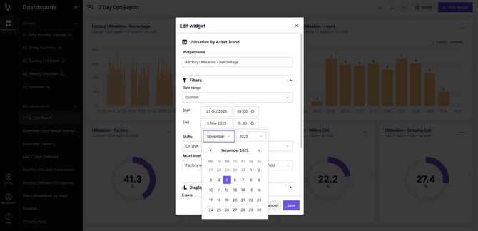
Set precise start and end times to analyse specific shifts, production runs, or any custom time period
New features:
Custom date and time ranges
Need to analyse a specific production run from Tuesday afternoon? Or compare performance across the first three days of the week? You can now do exactly that.
Previously, you were limited to preset date ranges like "Last 7 days" or "This month." Whilst these work well for general monitoring, they don't help when you need to investigate a specific time window.
Now you can:
- Select any start and end date using an intuitive calendar picker
- Set exact times down to the hour (e.g., 05:00 to 17:00)
- Analyse partial days, overnight shifts, or multi-day production runs
- Focus on the exact period when an issue occurred or when you made a change
This is particularly useful for investigating specific incidents, comparing before-and-after performance when you've made adjustments, or analysing utilisation of specific operations/jobs.
NOTE: We know that filtering data by specific shift is really important to our users and whilst custom times help. We're working on it and expect to release the filter in the next few months
Enhanced display value grouping options
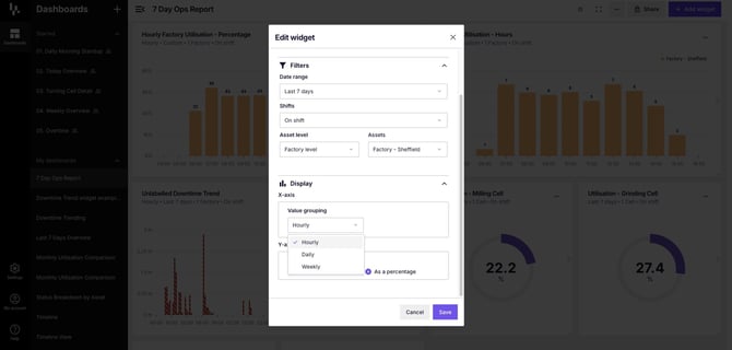
How you group your data changes what insights you can see. We've expanded your options to match different analysis needs.
When viewing data over several days, daily grouping has always worked well for spotting trends. But what about when you need more granularity? Or when you want to see longer-term patterns?
New grouping options include:
- Hourly grouping for up to 7 days of data – spot patterns throughout the day and compare hour-by-hour performance
- Daily grouping – see day-to-day trends (works with any date range)
- Monthly grouping – view longer-term performance over weeks or months
- Yearly grouping – for when last 12 months spans multiple years
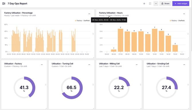
Choose hourly grouping to see detailed performance patterns throughout each day or over 7 days
The hourly grouping is especially powerful for manufacturers running multiple shifts. You can now see exactly when utilisation drops, identify which hours consistently perform best, and spot recurring patterns that daily summaries would hide.
For example, if your utilisation drops every day between 14:00 and 15:00, hourly grouping makes this immediately visible. You can then investigate whether it's a planned break, a recurring maintenance issue, or something else affecting performance.
Hourly data view reveals detailed performance patterns across an entire week
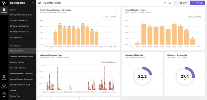
Works across all your widgets
These enhancements are available on all dashboard widgets that support date filtering. Whether you're viewing utilisation trends, downtime analysis, or status breakdown metrics, you now have the same powerful filtering capabilities.
The custom date ranges and grouping options work together seamlessly. Set your exact time period, choose the grouping that makes sense for your analysis, and get the precise view you need.
Got questions?
Don't hesitate to get in touch with our friendly support team by emailing support@fourjaw.com