.png?width=200&height=100&name=FJ%20white%20colour%20(400%20x%20200%20px).png)
How do you define utilisation?
Utilisation is the time that the machine is being productive (uptime) as a percentage of all the available time. It can be shown as a percentage of all the available time or in raw hours.
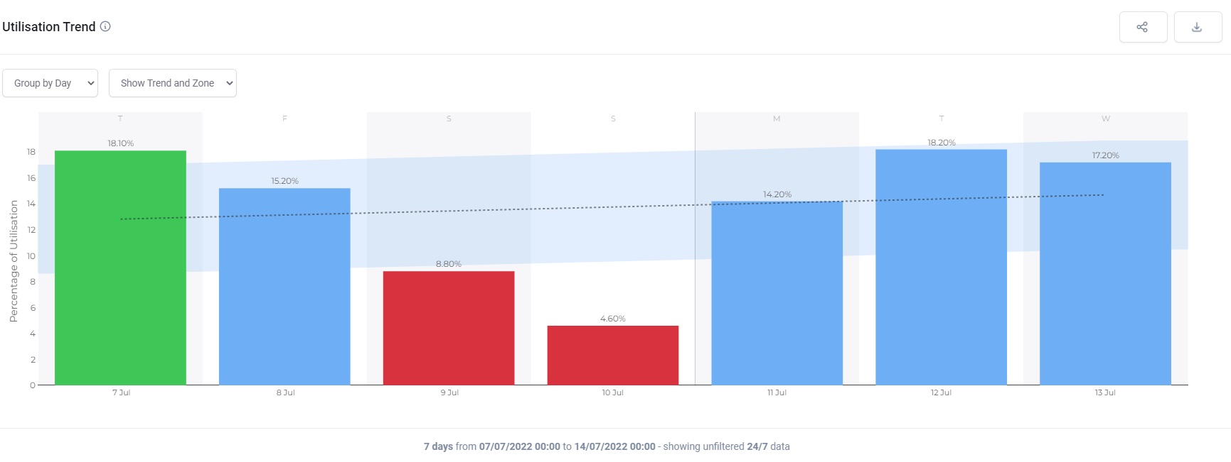
What does this plot show?
This plot shows utilisation and how that changes over time. There is a trend line with a zone around it of +/- one standard deviation. If the utilisation is above this line the bar is green. If it is below, the bar is red.
What can you change about it?
In the top menu, you can choose to look across the whole factory, or a particular cell, or a particular machine.
In the dashboard controls you can choose over what timeframe the data should be collected and whether the utilisation should be presented as a percentage or in hours.
You can decide whether to show time 24/7 or to only consider in-shift time.
How is it useful?
Use this chart to figure out whether actions you have taken are increasing utilisation over time. You can also use it to track whether you are achieving a utilisation target. If you have a weekly or monthly meeting on Utilisation you can tailor the chart for that meeting in the report section and then click run report before each meeting to get a copy.
Group by hour: 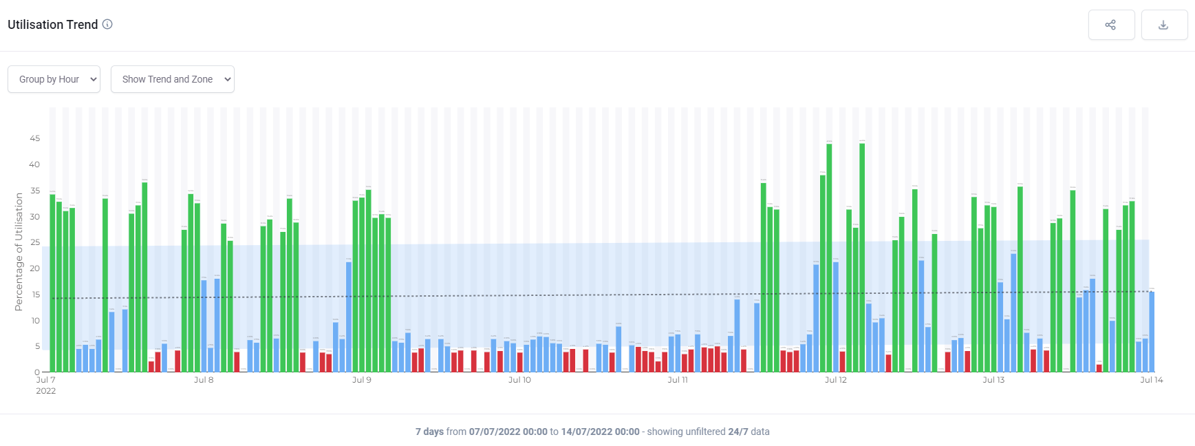
Group by day: