.png?width=200&height=100&name=FJ%20white%20colour%20(400%20x%20200%20px).png)
What does this plot show?
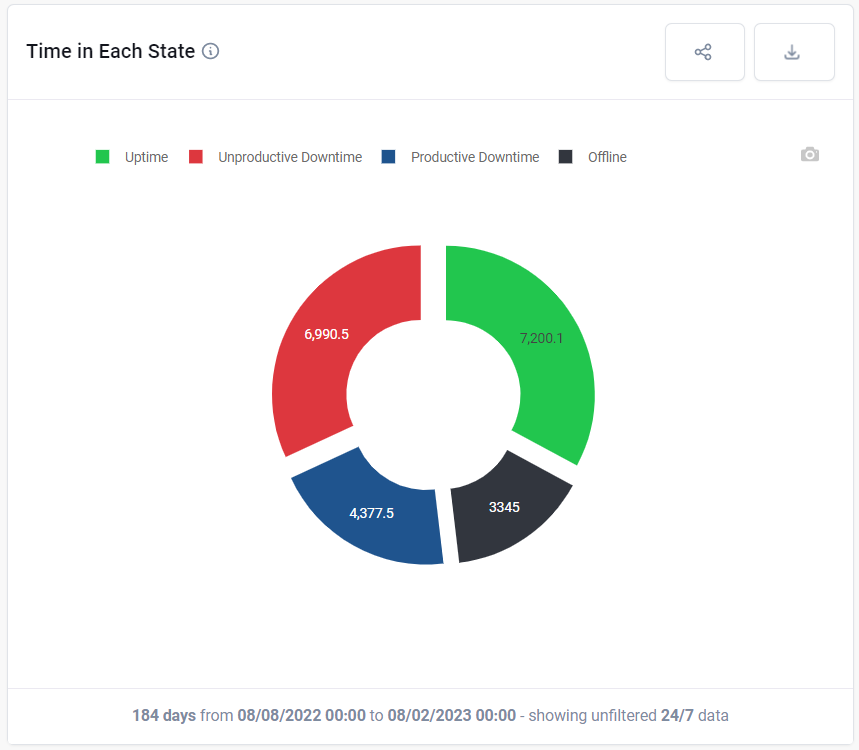
This plot shows the percentage of time that this asset (Machine, Cell, Factory) has spent in each state such as Uptime, Productive Downtime, Unproductive Downtime or Offline. In the settings Downtime page, you can choose whether your business considers a particular downtime reason to be Productive e.g., machine set-up or Unproductive e.g., unplanned maintenance.
What can you change about it?
In the top menu, you can choose to look across the whole factory, or a particular cell, or a particular machine.
In the dashboard controls you can choose over what time frame the data should be collected and whether the data should be presented as a percentage or in hours.
You can also decide whether to look at data 24/7 or only in shift periods.
How is it useful?
Use this chart to understand the amount of uptime and downtime at a high level. See how time is split between productive and unproductive downtime.