.png?width=200&height=100&name=FJ%20white%20colour%20(400%20x%20200%20px).png)
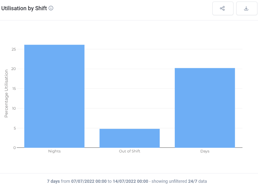
What does this plot show?
This plot shows the average utilisation of each shift (e.g. Days/Nights) in the selected time period.
What can you change about it?
In the top menu you can choose to look across the whole factory, or a particular cell, or a particular machine.
In the dashboard controls you can choose over what timeframe the data should be collected and whether the utilisation should be presented as a percentage or in hours.
You can change the shift patterns considered in the settings menu.
How is it useful?
Use this chart to figure out which shift needs help to improve productivity. See what is happening on shifts where there are fewer managers available.