.png?width=200&height=100&name=FJ%20white%20colour%20(400%20x%20200%20px).png)
How do you define OEE?
OEE is Overall Equipment Effectiveness. You can read all about it here.
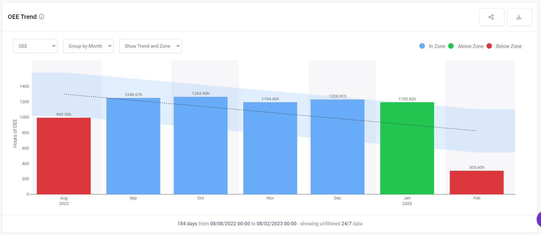
OEE Trend show
This plot shows OEE and how that changes over time. There is a trend line with a zone around it of +/- one standard deviation. If OEE is above this line, the bar is green. If it is below, the bar is red. You can also choose to see the availability, the performance or the quality
Above the chart you can choose to show the data per week or per month and whether to show the trendline.
In the top menu you can choose to look across the whole factory, or a particular cell, or a particular machine.
In the dashboard controls you can choose over what time frame the data should be collected and whether the utilisation should be presented as a percentage or in hours.
You can decide whether to show time 24/7 or to only consider in shift time.
Use this chart to figure out whether actions you have taken are increasing OEE over time. You can also use it to track whether you are achieving an OEE target.
Group by hour: 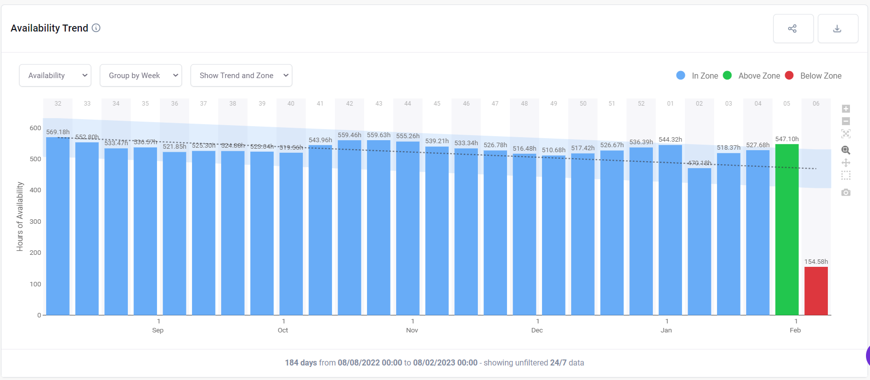
Group by day:
OEE by Shift Chart
This plot shows the aggregated OEE of each shift (e.g. Days/Nights) in the selected time period within the dashboard controls.

What can you change?
In the drop-down menu, you can choose to look across the whole factory, cell or a particular machine.
In the dashboard controls you can choose over what time frame the data should be collected and whether the OEE should be presented as a percentage or in hours.
You can change the shift patterns considered in the settings menu.