.png?width=200&height=100&name=FJ%20white%20colour%20(400%20x%20200%20px).png)
How do you define downtime? Downtime is any time that the machine is on but not being productive (i.e. during tool changeover, maintenance, breakdown etc.). It doesn't include time when the machine is offline / switched off.
What does this plot show? For the chosen time period and the chosen machine or cell, this plot shows either the percentage of time or number of hours there has been in each downtime. By presenting the highest % first, you can see which type of downtime is having the most impact on your business.
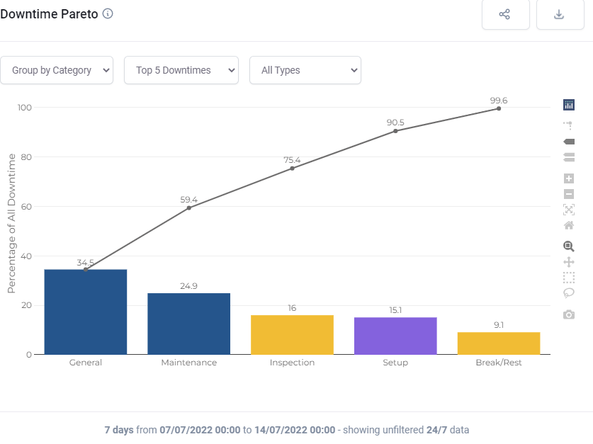
An example? If there are 4 hours of downtime in total, and 1 of those hours is due to 'Machine Fault', then you will see that 'Machine Fault' accounts for 25% of the downtime.
The dropdowns:
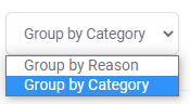
You can see the downtimes summarised into categories or as individual reasons.
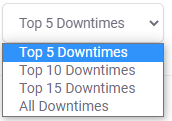
You can choose how many to see.
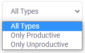
You can focus on just unproductive downtimes.