.png?width=200&height=100&name=FJ%20white%20colour%20(400%20x%20200%20px).png)
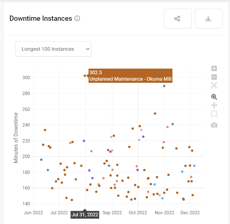
This chart shows you the longest downtime instances. Hovering over a dot shows you on which machine it happened and how long the machine was down. You can export this data using the button in the top right corner. In the export you can see not only the date that the instance occurred but also the time, enabling you to understand which shift it happened on and which operator could shed light on what happened. The CSV export can be used to create a pivot table to understand the average length of particular downtimes, spot anomalies, and check with certain downtimes get longer at different times of day.